DG3
Barplots of Categorical Variables
The graphs below summarize the distribution of a categorical biomarker variable as barplots, either in the overall population or by one or more categorical clinical variables.
We will use the cadsl data set from the random.cdisc.data package to illustrate the graph and will select on the biomarker evaluable population with BEP01FL. The column BMRKR2 contains the biomarker values on a categorical scale. We will use ARM as categorical clinical variable.
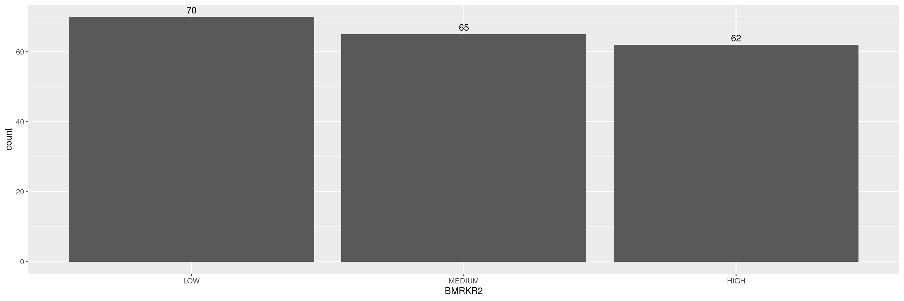
Here below the code for a simple barplot showing the counts of the categories.

We can customize the labels of the axes.
Code

We can also add the absolute count above each of the columns.
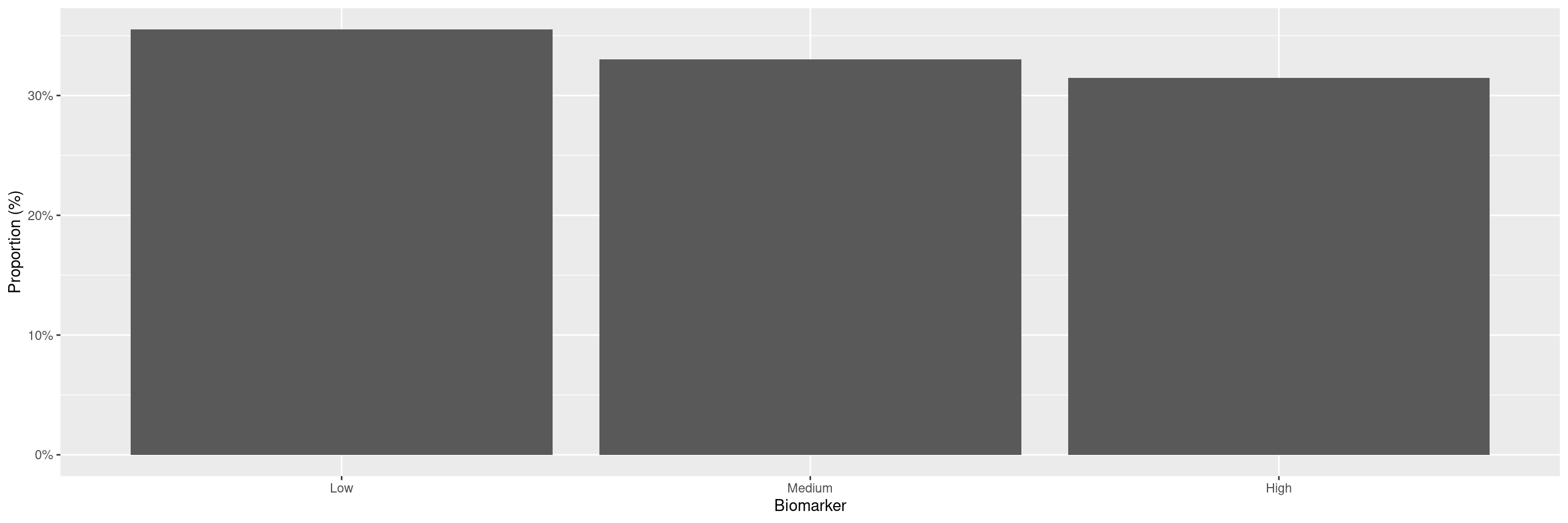
If instead of counts we want to display the percentages then the following options could be used:
Code
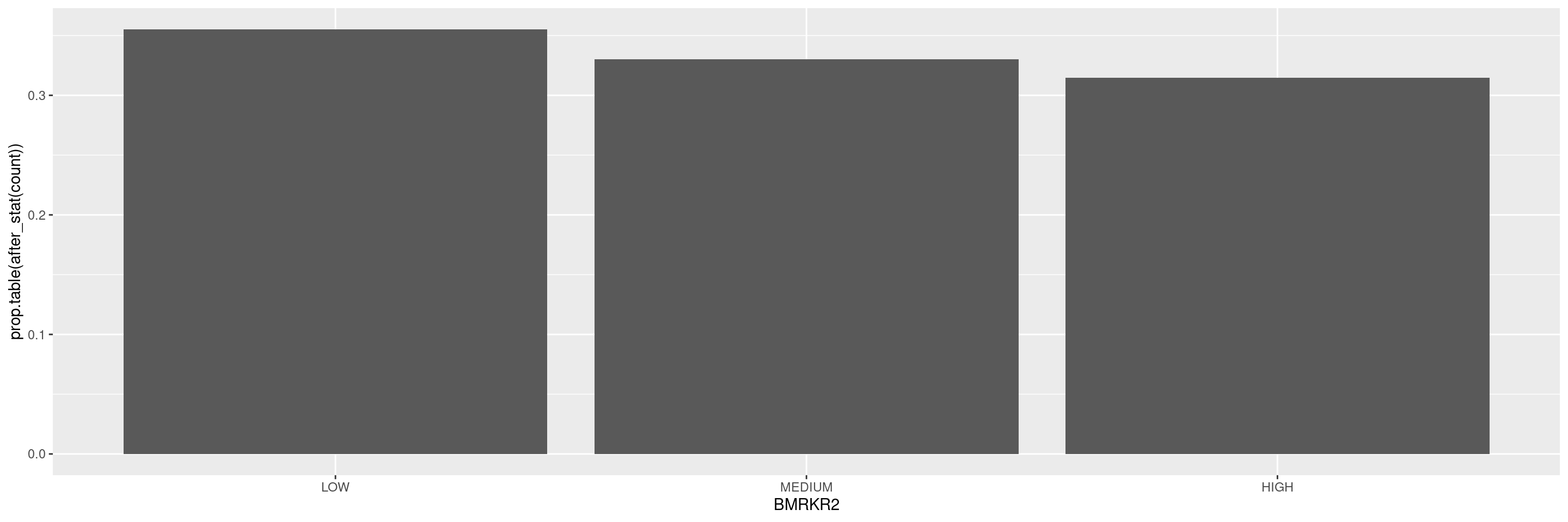
We can customize the axes.
Code
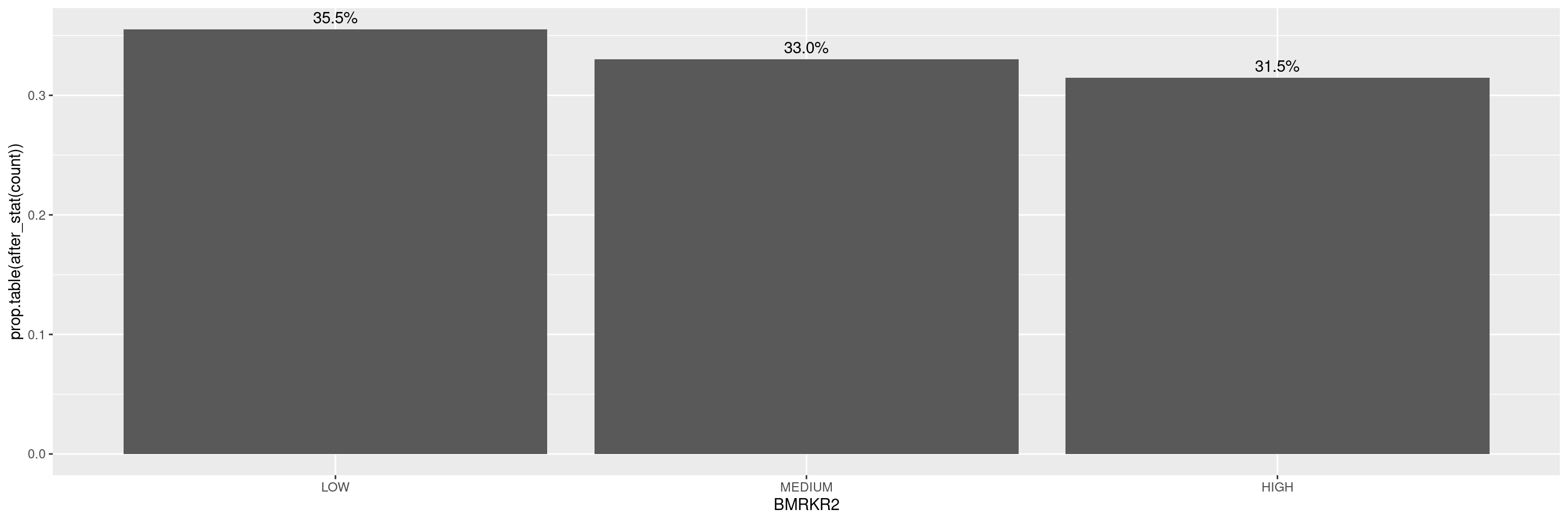
We can add the percentages above each of the columns.
R version 4.5.2 (2025-10-31)
Platform: x86_64-pc-linux-gnu
Running under: Ubuntu 24.04.4 LTS

Matrix products: default
BLAS:   /usr/lib/x86_64-linux-gnu/openblas-pthread/libblas.so.3
LAPACK: /usr/lib/x86_64-linux-gnu/openblas-pthread/libopenblasp-r0.3.26.so;  LAPACK version 3.12.0

locale:
 [1] LC_CTYPE=en_US.UTF-8       LC_NUMERIC=C
 [3] LC_TIME=en_US.UTF-8        LC_COLLATE=en_US.UTF-8
 [5] LC_MONETARY=en_US.UTF-8    LC_MESSAGES=en_US.UTF-8
 [7] LC_PAPER=en_US.UTF-8       LC_NAME=C
 [9] LC_ADDRESS=C               LC_TELEPHONE=C
[11] LC_MEASUREMENT=en_US.UTF-8 LC_IDENTIFICATION=C

time zone: Etc/UTC
tzcode source: system (glibc)

attached base packages:
[1] stats     graphics  grDevices utils     datasets  methods   base

other attached packages:
[1] dplyr_1.2.1         ggplot2.utils_0.3.3 ggplot2_4.0.2
[4] tern_0.9.10         rtables_0.6.15      magrittr_2.0.5
[7] formatters_0.5.12

loaded via a namespace (and not attached):
 [1] generics_0.1.4           tidyr_1.3.2              EnvStats_3.1.0
 [4] stringi_1.8.7            lattice_0.22-9           digest_0.6.39
 [7] evaluate_1.0.5           grid_4.5.2               RColorBrewer_1.1-3
[10] fastmap_1.2.0            jsonlite_2.0.0           Matrix_1.7-5
[13] backports_1.5.1          survival_3.8-6           purrr_1.2.1
[16] scales_1.4.0             codetools_0.2-20         Rdpack_2.6.6
[19] cli_3.6.5                ggpp_0.6.0               nestcolor_0.1.3
[22] rlang_1.2.0              rbibutils_2.4.1          splines_4.5.2
[25] withr_3.0.2              yaml_2.3.12              otel_0.2.0
[28] tools_4.5.2              polynom_1.4-1            checkmate_2.3.4
[31] forcats_1.0.1            ggstats_0.13.0           broom_1.0.12
[34] vctrs_0.7.2              R6_2.6.1                 lifecycle_1.0.5
[37] stringr_1.6.0            htmlwidgets_1.6.4        MASS_7.3-65
[40] pkgconfig_2.0.3          pillar_1.11.1            gtable_0.3.6
[43] glue_1.8.0               xfun_0.57                tibble_3.3.1
[46] tidyselect_1.2.1         knitr_1.51               dichromat_2.0-0.1
[49] farver_2.1.2             htmltools_0.5.9          labeling_0.4.3
[52] rmarkdown_2.31           random.cdisc.data_0.3.16 compiler_4.5.2
[55] S7_0.2.1