DG4
Scatterplots of Two Numerical Variables
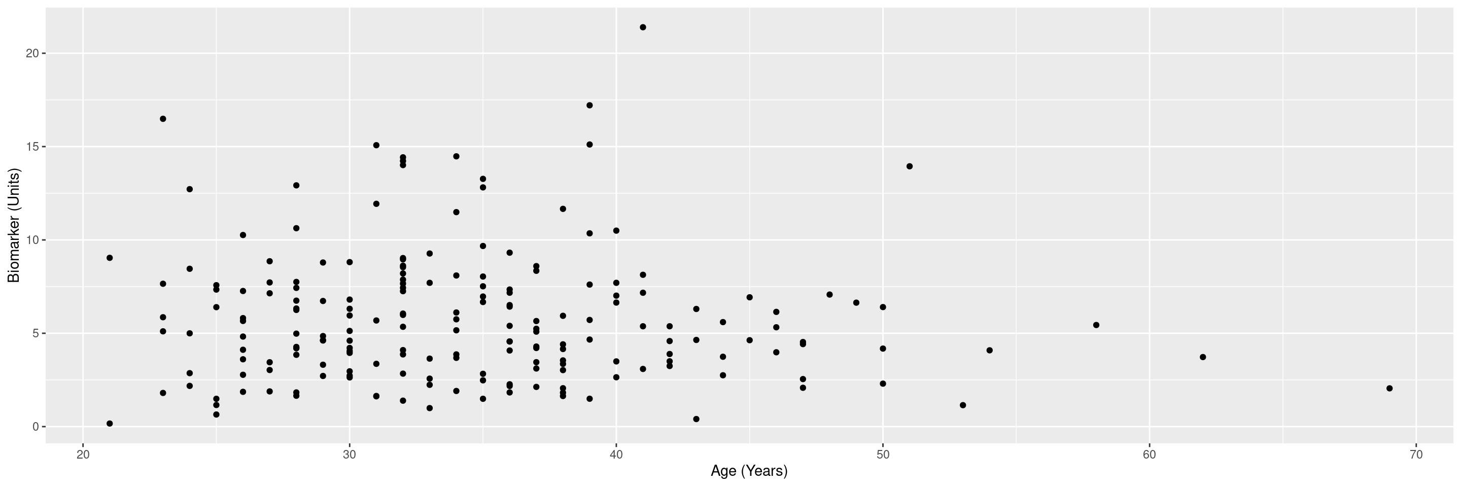
The graph below plots two continuous (biomarker) variables against each other.
We will use the cadsl data set from the random.cdisc.data package to illustrate the graph and will select the biomarker evaluable population with BEP01FL. The columns AGE and BMRKR1 contain the biomarker values of interest on a continuous scale.
Here is an example first on the original scale. Note that you may run into warning messages after producing the graph if the continuous variable you want to analyze contains NAs. To avoid these warning messages, you can use the drop_na() function from tidyr in the data manipulation step above to remove the NAs rows from the dataset (e.g drop_na(AGE, BMRKR1)).
Code
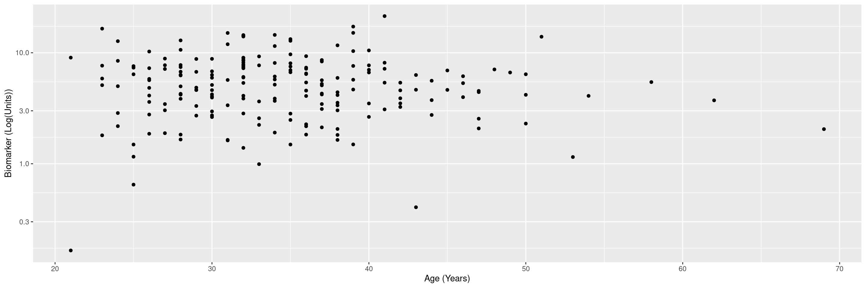
We can also plot it on a log scale.
R version 4.4.1 (2024-06-14)
Platform: x86_64-pc-linux-gnu
Running under: Ubuntu 22.04.4 LTS

Matrix products: default
BLAS:   /usr/lib/x86_64-linux-gnu/openblas-pthread/libblas.so.3
LAPACK: /usr/lib/x86_64-linux-gnu/openblas-pthread/libopenblasp-r0.3.20.so;  LAPACK version 3.10.0

locale:
 [1] LC_CTYPE=en_US.UTF-8       LC_NUMERIC=C
 [3] LC_TIME=en_US.UTF-8        LC_COLLATE=en_US.UTF-8
 [5] LC_MONETARY=en_US.UTF-8    LC_MESSAGES=en_US.UTF-8
 [7] LC_PAPER=en_US.UTF-8       LC_NAME=C
 [9] LC_ADDRESS=C               LC_TELEPHONE=C
[11] LC_MEASUREMENT=en_US.UTF-8 LC_IDENTIFICATION=C

time zone: Etc/UTC
tzcode source: system (glibc)

attached base packages:
[1] stats     graphics  grDevices utils     datasets  methods   base

other attached packages:
[1] dplyr_1.1.4           ggplot2.utils_0.3.2   ggplot2_3.5.1
[4] tern_0.9.5.9022       rtables_0.6.9.9014    magrittr_2.0.3
[7] formatters_0.5.9.9001

loaded via a namespace (and not attached):
 [1] utf8_1.2.4                    generics_0.1.3
 [3] tidyr_1.3.1                   EnvStats_3.0.0
 [5] stringi_1.8.4                 lattice_0.22-6
 [7] digest_0.6.37                 evaluate_0.24.0
 [9] grid_4.4.1                    fastmap_1.2.0
[11] jsonlite_1.8.8                Matrix_1.7-0
[13] backports_1.5.0               survival_3.7-0
[15] purrr_1.0.2                   fansi_1.0.6
[17] scales_1.3.0                  codetools_0.2-20
[19] Rdpack_2.6.1                  cli_3.6.3
[21] ggpp_0.5.8-1                  rlang_1.1.4
[23] rbibutils_2.2.16              munsell_0.5.1
[25] splines_4.4.1                 withr_3.0.1
[27] yaml_2.3.10                   tools_4.4.1
[29] polynom_1.4-1                 checkmate_2.3.2
[31] colorspace_2.1-1              forcats_1.0.0
[33] ggstats_0.6.0                 broom_1.0.6
[35] vctrs_0.6.5                   R6_2.5.1
[37] lifecycle_1.0.4               stringr_1.5.1
[39] htmlwidgets_1.6.4             MASS_7.3-61
[41] pkgconfig_2.0.3               pillar_1.9.0
[43] gtable_0.3.5                  glue_1.7.0
[45] xfun_0.47                     tibble_3.2.1
[47] tidyselect_1.2.1              knitr_1.48
[49] farver_2.1.2                  htmltools_0.5.8.1
[51] labeling_0.4.3                rmarkdown_2.28
[53] random.cdisc.data_0.3.15.9009 compiler_4.4.1